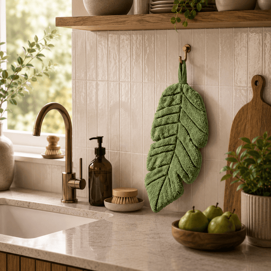
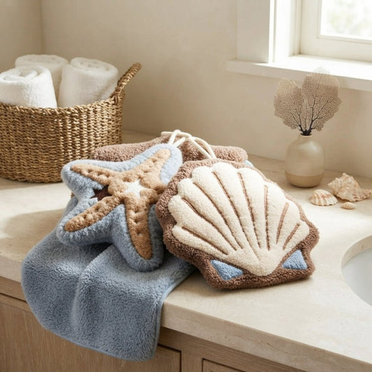
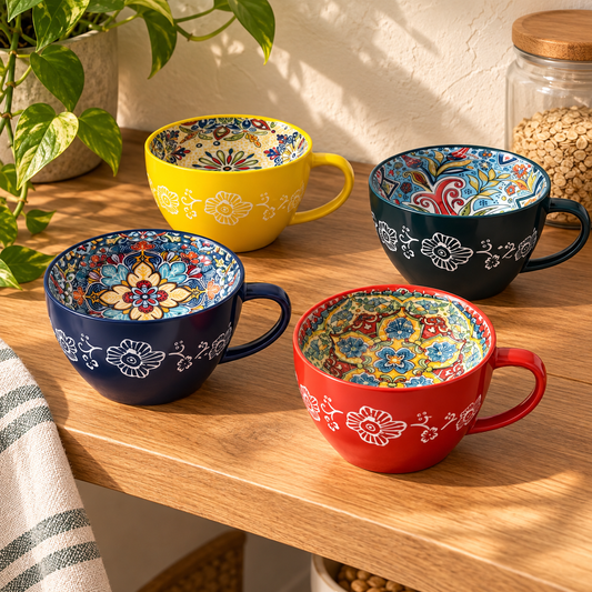
A neutral kitchen gives colorful ceramics room to shine. One patterned mug, a small serving dish or a favorite bowl can introduce a whole palette without changing your cabinets. The key is choosing a few colors to repeat, then giving the patterns some quiet company.
These three color stories pair expressive ceramics with plain textiles and familiar wood tones. Start with the pieces you own and try one small grouping before carrying the colors across the room.
Let one piece lead: Choose a ceramic piece you love, borrow two colors from its pattern, and repeat one in a plain towel or napkin. Keep the surrounding counter mostly clear.
If you mix patterns, vary their scale: a larger floral motif can sit beside a fine stripe when they share a color. You do not need every shade to match exactly. Aim for a family resemblance, and keep the largest surfaces neutral so your favorite pieces stay noticeable.
1. Olive, ochre and oatmeal: warm and grounded

This combination sits comfortably beside cream cabinets and honey-toned wood. Use olive as the main ceramic accent, with mustard or ochre appearing in a smaller detail. Oatmeal textiles connect the two without adding another strong color.
Try a patterned mug beside a plain green dish on an existing wooden board. Fold an oatmeal towel nearby and stop there. Repeating the wood tone already present in your cabinets or shelves helps the arrangement feel connected to the kitchen.
With orange-toned oak, choose a softer ochre and let green do more of the work. If the kitchen already feels very warm, use more cream around the grouping.
Try the formula: olive ceramics + one ochre detail + plain oatmeal linen + warm oak.
For a starting point, explore Fiora’s patterned mugs or Nerina’s green dishes. Choose the current color option that suits your room.
2. Dusty blue, soft white and pale oak: fresh and easy

Blue-and-white ceramics bring definition to an ivory kitchen while pale wood keeps the scene relaxed. This is a useful direction when you enjoy color but prefer a lighter overall effect.
Let a pair of patterned mugs be the focal point on a reachable shelf. Below them, use a plain white cup or blue dish and an ivory cloth with a fine blue stripe. The shared color connects the patterns even when their designs differ.
Keep the white tones compatible with your existing surfaces. A creamy backsplash may look more comfortable with softened blue and ivory than with a very bright white. Compare the pieces together in the kitchen’s daylight and evening light.
Try the formula: blue-and-white patterned ceramics + one plain white piece + restrained striped linen + pale oak.
Zella’s patterned dipping dishes offer another way to introduce color. Review the full assortment rather than expecting every dish to follow one blue palette.
3. Terracotta, dusty blush and cream: soft with a little character

For a softer kitchen accent, combine earthy red details with dusty pink and warm cream. Keep terracotta concentrated in a small dish or ceramic pattern, then use blush in one plain textile.
Medium oak adds depth to this palette. A familiar board can gather the pieces into one breakfast grouping, leaving the rest of the counter free. If your cabinets are dark, increase the amount of cream so the arrangement remains easy to read.
Try the formula: rust-patterned ceramics + a dusty rose accent + warm cream + medium oak.
Nerina in Dusty Rose can supply a small blush detail. Use textiles you already own before buying a matching set.
Your quick mixing checklist
- Choose one patterned ceramic as the starting point.
- Repeat two of its colors, with one taking the lead.
- Pair a busy pattern with plain linen or a quiet stripe.
- Echo an existing wood tone and leave preparation space clear.
- Check the colors together in daylight and evening light.
The photographs are illustrative styling examples, rather than exact product sets. For the broader method, read our room color palette guide. Explore the Kitchen collection for a useful piece that fits the story you want to tell.